.avif)
.avif)

Presentations have changed a lot over the past year. With the rise of AI-powered design tools, smarter workflows, and increasingly remote, fast-paced communication, audiences now expect more clarity, stronger visuals, and tighter storytelling than ever before. Attention spans are shorter. Standards are higher. And the margin for clutter or confusion is smaller than it used to be.
Yet many teams are still carrying outdated habits into their decks—crowded slides, endless bullet lists, inconsistent design, or charts that leave audiences guessing. As we step into 2026, it’s the perfect time to reset your presentation approach and leave those old habits behind.
Below are the most common presentation mistakes to retire from 2025, along with modern best practices to help you create clearer, more compelling decks in the year ahead.
Overloading slides with text
One of the most persistent presentation mistakes is treating slides like a teleprompter. Dense paragraphs and overloaded bullet lists force audiences to read and listen at the same time, which almost always means they do neither.
In 2026, strong presentations prioritize focus and visual clarity. Each slide should communicate a single idea, anchored by a clear headline and supported by minimal text or visuals that reinforce the message. Extra context belongs in speaker notes—not on the slide itself. When slides are concise, presenters are free to tell a story instead of competing with their own content.
Inconsistent fonts, colors, and layouts
Nothing erodes credibility faster than inconsistent design. When fonts, colors, or layouts change from slide to slide, presentations can feel rushed or unpolished—even if the content itself is strong.
Modern teams leave manual formatting behind in favor of systems that enforce consistency automatically. Brand kits, shared themes, and reusable templates ensure that every deck looks cohesive and on-brand, no matter who creates it. Consistency doesn’t just improve aesthetics, it builds trust and helps audiences focus on the message instead of the design.
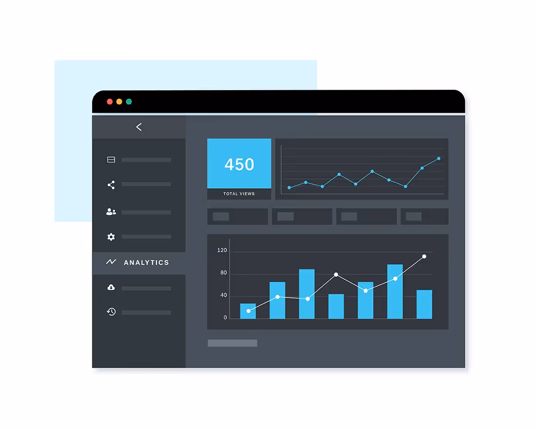
Presenting data without a clear narrative
Charts don’t speak for themselves. Too often, presentations include complex visuals that show everything but explain nothing, leaving audiences unsure of what to take away.
In 2026, data should always serve a story. Every chart should answer a specific question, and every slide headline should clearly state the insight—not just describe the visual. Clean formatting, clear labels, and intentional callouts help guide attention and make data easier to interpret. When data is framed with purpose, it becomes persuasive instead of overwhelming.
Reading directly from the slides
If your slides contain everything you plan to say, your audience has little reason to stay engaged. Reading word-for-word signals low preparation and flattens even the most important message.
Instead, slides should support your delivery (not replace it). Concise visuals paired with thoughtful speaker notes allow presenters to add depth and context without cluttering the screen. Rehearsing with those notes helps ensure a smooth flow and a more confident, conversational delivery.
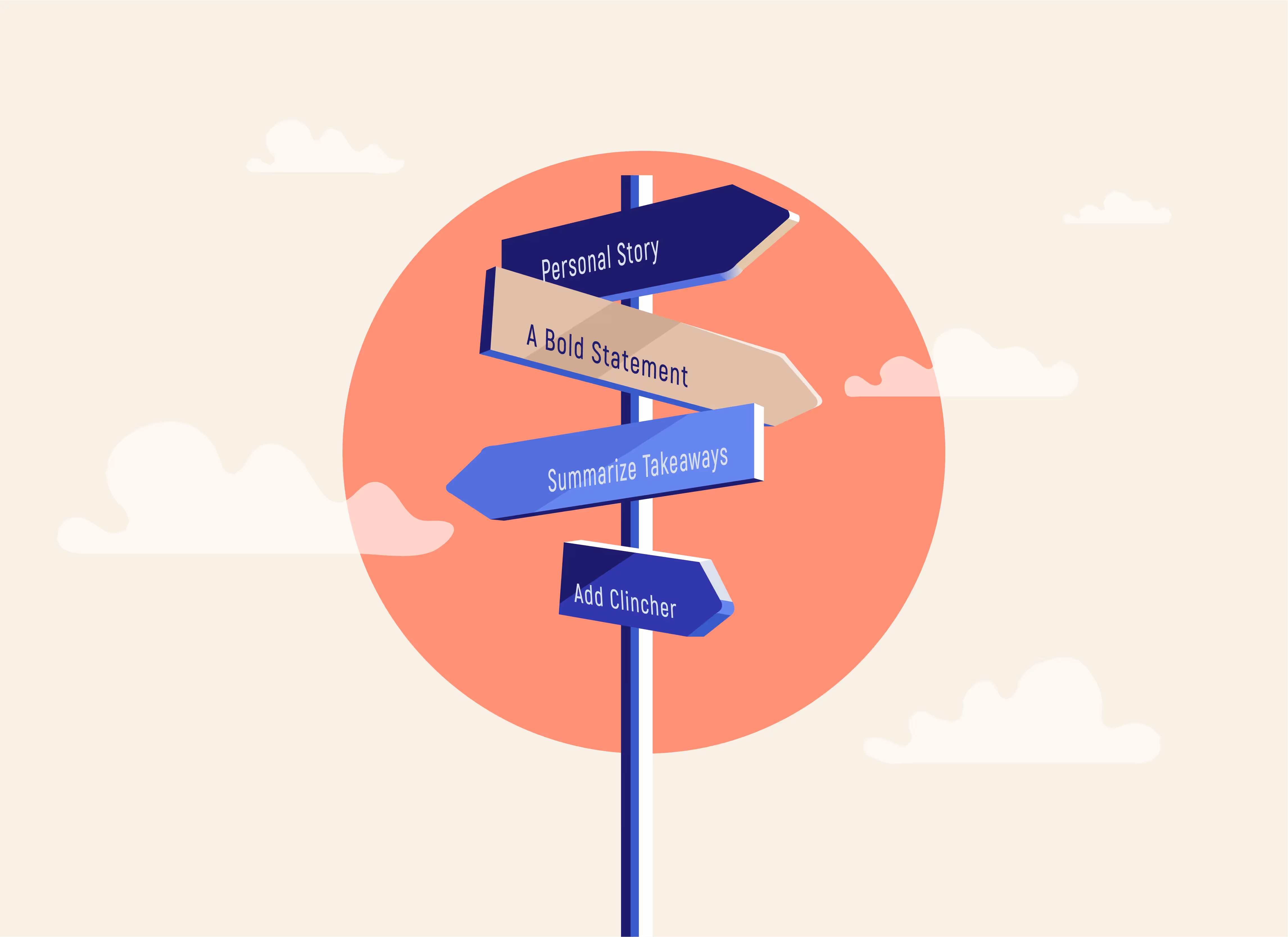
Using too many slides (or worse, too few)
There’s no universal “right” number of slides, yet many presentations suffer from extremes. Too many slides can feel exhausting, while too few can force too much information into a single frame.
Strong presentations break ideas into digestible pieces and let the story determine the structure. In 2026, AI-powered outlining and structuring tools make it easier to organize content logically, ensuring each slide earns its place. The goal isn’t to hit a slide count, it’s to make every point count.
Ignoring accessibility
Accessibility is no longer optional. Low contrast color palettes, tiny text, and visuals that rely on color alone can exclude large portions of your audience.
Modern presentation design considers accessibility from the start. High-contrast color pairings, readable text sizes, and visual cues like icons or patterns ensure that information is clear for everyone. Designing with accessibility in mind doesn’t limit creativity, it improves clarity for all viewers. This is especially important for remote presentations where audiences might be viewing on different devices and size screens.
Cluttered or distracting visuals
Busy layouts, unnecessary animations, and generic stock imagery can quickly date a presentation and pull attention away from the message.
In 2026, effective visuals are intentional and restrained. Clean layouts with thoughtful spacing help ideas stand out, while modern imagery reinforces—not competes with—the content. Subtle animation should be used sparingly and only when it adds meaning or improves flow. Simplicity is what makes presentations feel polished and current.
Not tailoring content to the audience
A presentation built for executives shouldn’t look or sound like a team training deck. Yet many presentations fail because they assume one message fits every audience.
Great presenters adapt their content based on who’s in the room. Tone, depth, visuals, and calls to action should shift depending on whether you’re pitching, reporting, or educating. Using different templates and structures for different audiences helps ensure your message resonates and drives the right outcome.
Leaving no time for rehearsal
Even the best-designed deck can fall flat without preparation. When presentations are built at the last minute, rehearsal is often the first thing to go.
Finalizing your deck early creates space to refine transitions, test timing, and identify gaps in the story. Practicing out loud, and getting feedback from a teammate, can dramatically improve clarity and pacing. In 2026, prioritize presentation software (like Beautiful.ai) that makes presentation design faster so you can focus on what really matters. After all, preparation is what turns a good deck into a strong presentation.
Starting from scratch every time
Starting from a blank slide is one of the biggest productivity drains in presentation design. It leads to inconsistent structure, slower workflows, and unnecessary rework.
The most effective teams in 2026 rely on smart templates, shared slide libraries, and AI-assisted tools to generate first drafts quickly. Reusing proven structures frees you to focus on refining the message instead of rebuilding the framework every single time.
Start the year with modern presentation habits that help you get ahead
Leaving these outdated presentation mistakes behind will help you communicate more clearly, move faster, and look more professional in every setting.
Whether you’re pitching, reporting, educating, or storytelling, great presentations in 2026 come down to three things: clarity, consistency, and design that supports your message instead of overshadowing it.
If you still don’t know where to start, explore our library of pre-built, customizable presentation templates and tailor it with our AI-powered features to meet your story.


.avif)